Your Cart is Empty
🎁BUY 2, GET 1 FREE + FREE WORLDWIDE SHIPPING 🚚
🎁BUY 2, GET 1 FREE + FREE WORLDWIDE SHIPPING 🚚
What is Pop Art ?
7 min read

You must have heard the term pop music once in your life. Originating in the 1950s, pop has become a popular music genre of this Era. Similar to how pop entered music, it also made its way to art. Pop art became a movement in the 1950s and got popular among artists in the 1960s.
Birth of Pop Art
Pop art was the breakthrough from traditional views of art. It started in Britain in the mid-1950s and became a thing in the US in the late 1950s. Reaching its peak in the 1960s and forming the shape of a movement, pop art encouraged artists to take inspiration from anything. It inspired young artists to mimic their daily lives in the form of art. They turned to sources like movies, comic books, pop music, and even commonplace objects like burgers, soup cans, etc. for their inspiration.
The perfect definition of pop art is what Richard Hamilton has told his friends in a letter, "Pop art is popular, transient, expendable, low cost, mass-produced, young, witty, sexy, gimmicky, big business and Glamorous."
Although there is not much difference of time when pop entered British art and American art, both are identified as somewhat distinctive from each other.
A Brief History of British Pop Art
In 1952, a group of British artists naming themselves, The Independent Group, held out regular meetings at the Institute of Contemporary Art in London to discuss topics such as pop culture's place in art, science, and technology. The group had both artists and architects included. Some of them are Eduardo Paolozzi, Richard Hamilton, architects Peter and Alison Smithson, and critics Reyner Banham and Lawrence Alloway. In the 1950s, Britain was still recovering from the severe impacts of the war and the citizens were uncertain about the pop culture. The group certainly had doubts about its commercial character, though the rich imagination the culture provides was enough to fascinate them. The imagery that was discussed by the group is just your everyday objects. The topics include science fiction, comic books, billboards, soup cans, rock music, and automobile design.
The actual term 'pop art' can have many origins, but the actual definition was given by Richard Hamilton in one of his letters to his architect friends in 1957. Although, ten years before that, the first-ever artwork with the term 'pop' incorporated, was release by Eduardo Paolozzi. The artwork included cut-up images of a pinup girl, Coca-Cola logo, World War II bomber, cherry pie, and a man's holding a pistol. The pistol had a cloud bursting out with the word 'Pop' on it.
A Brief History of American Pop Art
In the 1950s, artists in New York City faced a critical point in art, where a revolt was an uprising in the face of strict laws advocated by modernism. Jasper Jones, at that time, was continuously poking the conventions by producing abstract art which incorporated some of the things that we use in our daily lives. These things included flags, handprints, numbers, letters, and targets. Robert Rauschenberg also made his contribution to the revolt by incorporating found objects with traditional techniques such as using oil painting.
Similarly, Allan Kaprow and Fluxus also contributed to the revolt and later on started a movement with other artists which became known as Neo-Dada. Some of the popular classic artists, Roy Lichtenstein, Claes Oldenburg, Andy Warhol and James Rosenquist, followed into the footsteps of this movement's founders.
How to Identify Pop Art ?
Characterization of pop art is generally done with bright & bold colors: blue, red, and yellow. Much like your common comedian strip palette, the colors have been generally bright and shiny. These colors are not used to represent the artist's self or inner world in contrast to the previous classical art forms. Though these colors contemplate the vibrant famous tradition around them.
Hard-edged compositions are a popular reason to defuse the "pictorial ease" of styles such as Abstract Expressionism. Therefore, many pieces of pop art consist of distinctive or fragmented shapes. Some artists satirized the objects by enlarging them to almost comical dimensions.

Popular Artists of Pop Art
Andy Warhol
Warhol was one of the highest-paid illustrators even before he started to work for galleries. Throughout his childhood, he faced poverty but rose to become a gem of the New York art industry. The popularity came from when he started to discover the newly founded genre of art, Pop Art. His famous work includes the illustration for Campbell's Soup, Coca-Cola, and his screen-printed version of Marilyn Monroe.

Andy Warhol’s painting of ‘Campbell’s Soup Can’
Apparently, the idea of painting a soup can was from Muriel Latow who was a gallery owner. Muriel suggested Andy take inspiration from the daily objects and incorporate them in his paintings. In 1962, Andy started painting Campbell's soup cans, Coca-Cola bottles, and Brillo boxes. Not even his vague imagination, he would have thought that this will make him a successful consumer ad designer. From then on, Andy and his imaginations took advertising to a new level. His paintings portrayed the feelings of being in a supermarket.

Pop Art portrayal of Marilyn Monroe
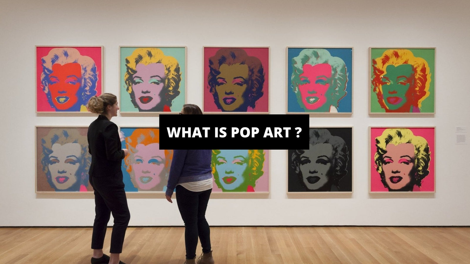
In his portrayal of Marilyn Monroe, he took a black and white publicity photo of her and created several replicas of it. In Gold Marilyn Monroe, painted the background with a golden color to depict how we, as commoners, have glorified the celebrities to the level of the divine. His portrayal showed the life of a woman who rose to fame and lost her life to a horrible tragedy.
Roy Lichtenstein
Roy Lichtenstein along with Andy Warhol was part of the movement known as Neo-Dada. He was also one of the few American artists of his time, who were renown widely. Roy was more famous for the controversies than his art. He was always the subject of criticism because of his connections with the movement and his distinct method of art. He came to know about pop art culture in 1961 and got inspired by comic strips to create unique pieces of art. The critics were still not satisfied with his art and accused him of lack of originality and copying.
Some of the popular art by Lichtenstein includes Popeye, Drowning Girl and Yellow Landscape. Popeye depicts the image of Popeye, a popular cartoon character, punching his rival in the face. Though it might have just been a spark of inspiration Roy had at that time, some people think that the punch was a sly response to the critics who thought that the art should make an immediate visual impact on the observer.

Original Pop Art of ‘Drowning Woman’ by Robert Lichtenstein
Although Robert Rauschenberg and Jasper Jones were the first ones to incorporate popular imagery into their works, Roy was the first one to perceive cartoon imagery as a working material for his artwork. His art laid the foundation for modern pop art and his works are considered to be of high existence.
Eduardo Paolozzi
Immigrated to Scotland from Italy, Eduardo didn't have the brightest of childhood. World War II was breaking out and people lived in fear. As a family living in the country directly involved in the conflict, Eduardo explored the many ways in how humans are affected by external resources. His art resembled his life in the way of balancing light and dark. On one hand, he produced sculptures with dark and brutal aura and shape, and on the other, he made collages that were brighter in nature.

Mosaic Mural by Eduardo Paolozzi at Tottenham Court Road
One of the most famous works of Paolozzi is 'I was a rich man's plaything'. It came out in 1947 and it was a part of a series of images called 'Bunk'. This series was specifically oriented on the images obtained from American Magazines which he got from American ex-soldiers in Paris.
The naming sense behind bunk was that it can be seen both as a normal shell-like bed or as the synonym for non-sense. His perception here was to define the condition of a soldier, far from home, lying on the hard-rock bed, dreaming about life back home, reading a magazine.
The piece includes a cover to a magazine called 'Intimate Confessions' that features a voluptuous woman who spills her secrets in the magazine, as the name implies.

Original Pop Art of ‘I was a rich man’s plaything’ by Eduardo Paolozzi
Dr. Pepper was the second most famous artwork by Paolozzi and also a part of the 'Bunk'. Paolozzi cut colorful images from different magazines and assembled them to create a montage of art. His montage also included animated and photographed images of an attractive woman which he used to show the American consumer culture. He depicts how attractive women are being used to market products, cars, appliances. Later on, this became a symbol for the branded 'Dr. Pepper' soft drink.
Pop Art is not just alive today but flourishing like it did in the 1960s and 1970s. Artists like Jeff Koons, Alex Katz, and Yayoi Kusama have still kept the tradition alive and going. With the art thriving like this, it’s right to say that it isn’t going to die anytime sooner.
Pop Art for your Home Decor
Our pop art includes funky colorful statements revolving around famous personalities or fictional characters like Marilyn Moore, Einstein, Lady Diana, The Queen of United Kingdom, and Mickey Mouse. You may feel like our art is no different than portraits. However, that is not the case. We can make absolutely any graphic, picture, or character exotic, fun, and unique with the way we use colors, graphics, backgrounds, texts, and combinations of all of our main elements.
For instance, recreating a picture of Einstein by adding different and unusual color combinations to his hair and his entire face is how we bring innovation and uniqueness to our work. Then, adding a detailed funky background with lots of colors and words helps make the artwork come to life. A significant touch of satire is something we never miss on. By adding the element of a stuck-out tongue or an unrelated object, we create wit and humor.
Another prominent example of the pop art that we create for our clients would be detailed backgrounds. For instance, one of our statement artworks revolves around The Queen of The United Kingdom. To make the image stand out, we made use of primary colors in all the graphic details. However, our focus was the background. To add a cyberpunk and retro vibe, we used various colorful objects such as rainbows, crowns, and significant texts. Pop art couldn't get better!
Our pop art includes the following main elements:
- Identifiable visuals adapted from popular products and media sources
- Bright, vibrant color combinations
- Imagery and visuals inspired by newspapers or comic books
- Unique text boxes and speech bubbles
- Images or Graphics of celebrities or popular characters from comics, magazines, and shows.
- Various fonts
- Random funky objects to bring humor or satire.


